The brand is currently one of the greatest assets of a company, with the most iconic brands being counted in millions of dollars. As with all assets, the brand also needs occasional maintenance.
Our branding has been with us since 2018. The world has moved on, and so has Tooploox, evolving and adapting to new realities. We reached the point where our current branding and communication didn’t fit the company’s identity as well as they once did.
Also, the evolving organization began to speak with customers using a voice that didn’t match the brand. This could cause confusion among clients, employees, candidates, and prospects alike.
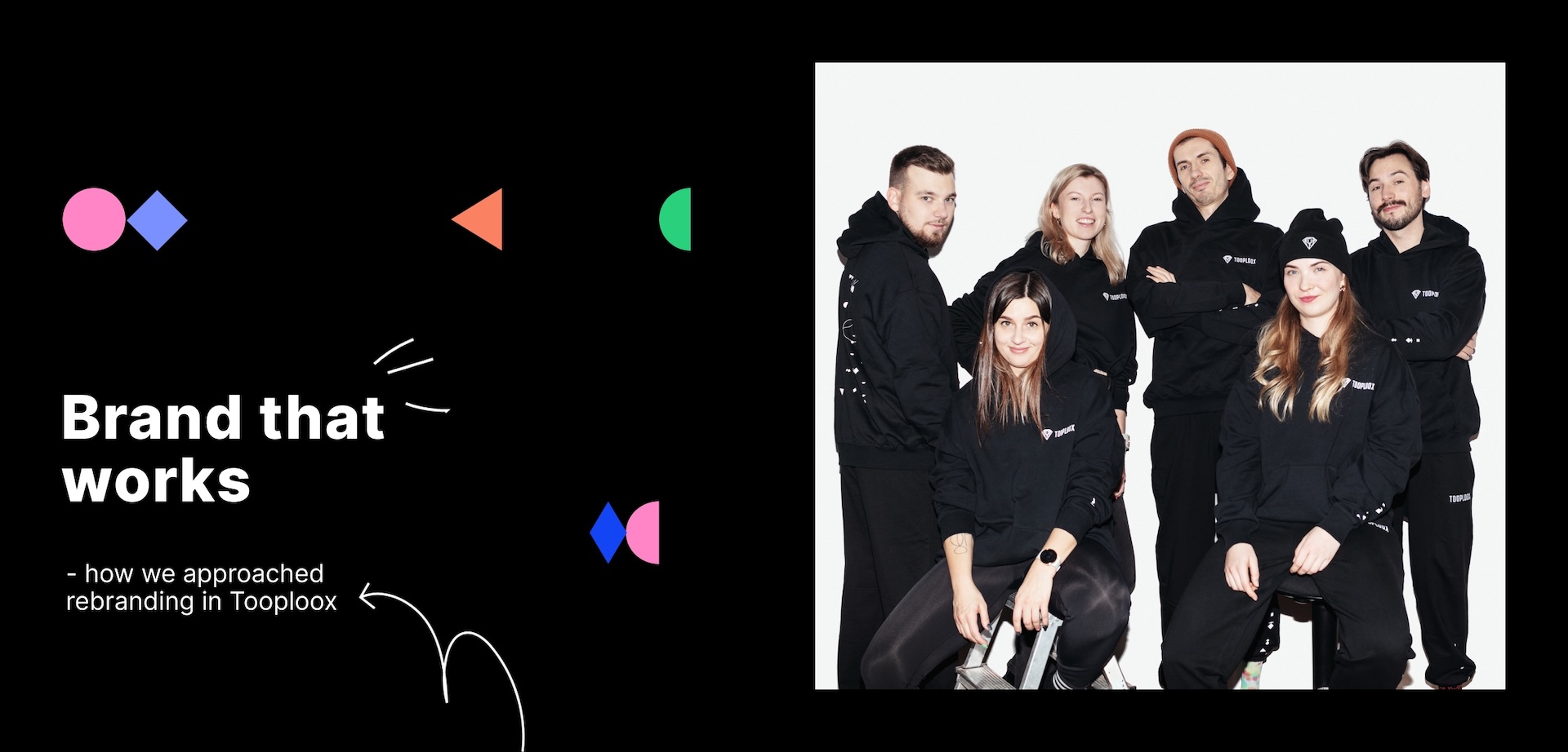
“Being an in-house brand designer has taught me many things I wouldn’t have known working only for a client for a time- or on a project- in limited cooperation. First and foremost you know your company inside and out and innately know where the opportunities are where the brand can highlight its stories,” Comments Aga Sierzputowska, Head of Branding.
That’s why we decided to refresh our brand as well as brand voice and visual identity.

Before we start
Our starting point was more than fitting. We have a strong team of creatives in our marketing team: brand specialists and content creators. Yet we decided we want to cooperate with one the best branding agencies, Admind.
Their specialists had a fresh look at something we work on every day, so they were unbiased and could leverage their experience. Their perspective earned while working on multiple projects could also enhance the process.
Also, we wanted to learn some new tricks too!
Communication design
The journey started with a brand audit, which enabled us to face the truth about how the external world sees Tooploox and how far it is from what we think it is. This included a series of workshops to understand and explore our problems, questions, and ideas and examine how we work with our clients. Admind delivered a final report with a new version of our brand DNA. This was also a way to name and categorize our ideas into an organized framework to use in the future.
The workshop resulted in the creation of a new brand strategy document, which was further used in internal and external communication alike. Our new brand voice took the form of a “great field” story, laying the foundation for the way Tooploox communicates with clients, prospects, employees, and candidates – exposing a different angle to the same story.
The next step was to design the visual aspect of the story.
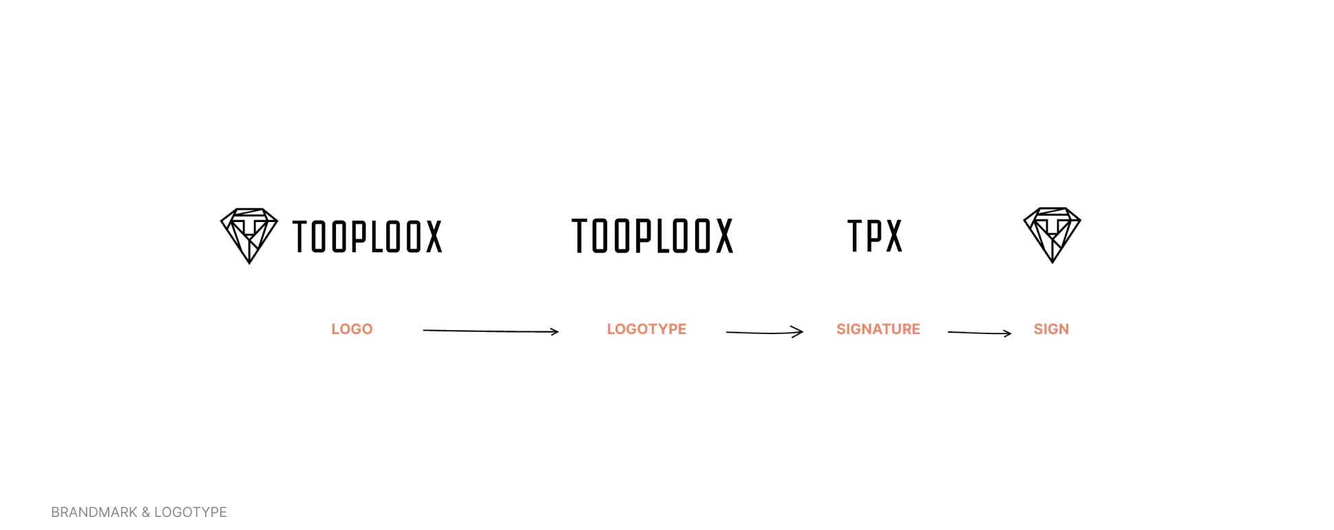
Design Assumptions for the rebranding
After such an intensive segment of research and analysis, there was a lot of pressure to make the visual aspect of branding jive with the high standards we kept across all of our brand tools. We knew we needed some factors to use as assumptions to create boundaries for our imaginations, but we also needed something extraordinary, more than the system we had before. A truly new quality flourishing from all we have achieved.
Main assumptions
- Communication strategy is the backbone of graphic design, yet these are separate realms. Our garden and great field don’t have to be „real life” plants and flowers, but rather work as inspiration.
- Bringing plants and gardens into the realm of geometry has placed ordered structure, rules and a grid over the concept of organic growth and matter—the idea of a high-tech garden that could have grown in the Tron movies.
With that in mind, we decided to make geometric shapes the basis of all forms of our key visuals. This work was also backed by the ideas and consultations of an experienced Admind team along the way!
Flexible design system
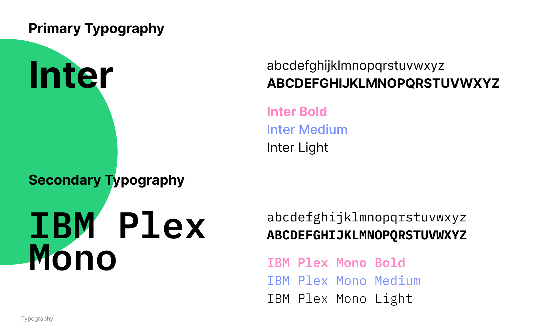
Having all our assumptions in place to be our road signs on our journey to new branding, we started to work. Yet to aim higher than before, adding things to the updated static elements of the brand, like color palette, illustration and icon style, typography, etc, we decided to leverage the power of a flexible design system.
A traditional design system (based on just a symbol) does not adapt well to the new world, new channels, social media, and technology. Being a high-tech company, we needed more flexible systems, as we need to constantly grow and be able to solve communication problems on the go. That’s why we decided to follow the Flexible Design System principles.
The core of the system is the balance between creativity and the rules imposed on the graphic design team. For example, we decided to deliver a limited number of basic components, set the boundaries on the number of components to be used, their positioning, and their usage.
With that, we were able to design a system that would be equally effective when used regardless of the context or placement. The system is equally effective and delivers consistent branding no matter if it is to be applied on a post-stamp or in a mural.
The flexible design system comes with boundaries, yet is composed of the key elements listed below:
Basic components – The essentials of our Key Visual
The primeval elements are the basis of all complex forms in the world, nature, and science. These are the building blocks of our surroundings. They give proportion and harmony, are a starting point for the growth of form, and make keeping the coherence of color and decorations easier.
- THE FIELD – Black represents the soil of our garden and the foundation of our key visual. Utilize an entire black canvas as the backdrop for visuals, giving viewers a strong and clear starting point for their journey.
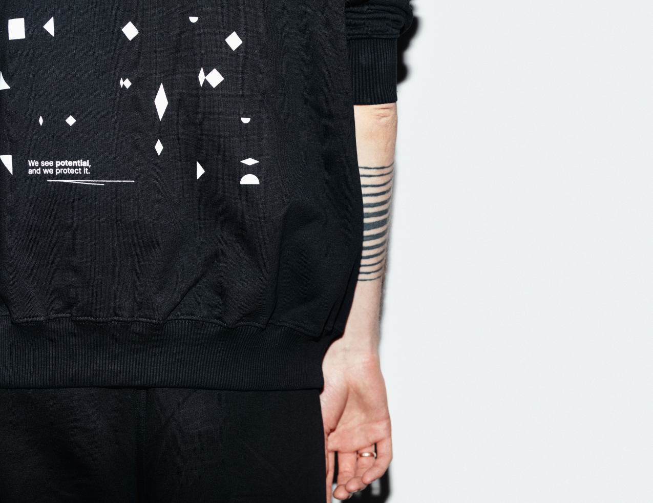
- THE SEEDS – The seeds are a visual representation of the growth that is fostered within our company between our people and our clients. As we work together, we grow together, and this is represented visually by the scale of our shapes.
Using basic shapes is also backed by psychology. The human eye looks for shapes and symbols they know and recognize. In fact – this is the magic behind consistent branding. Using basic shapes appeals to all people around the world, no matter their background and culture. By that, our message is clear to everyone.
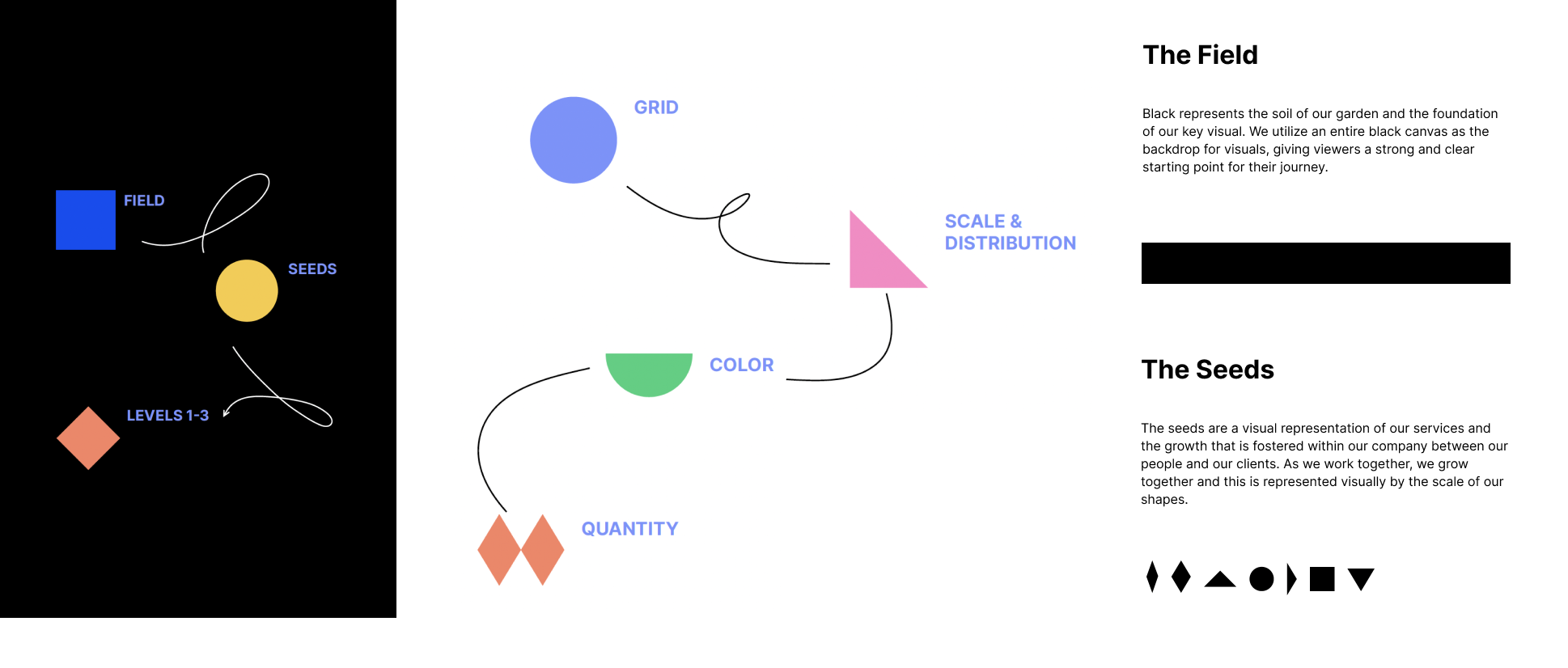
Underlying grid
Although the placement of each shape is seemingly random, there is an underlying grid in which the shapes are algorithmically placed. The purpose of this grid is to help establish visual consistency for our pattern-like visual while allowing for a controlled element of chaos and random generation.
This approach fits the idea of the great field where plants flourish both as the result of human labor and nature’s own initiative.
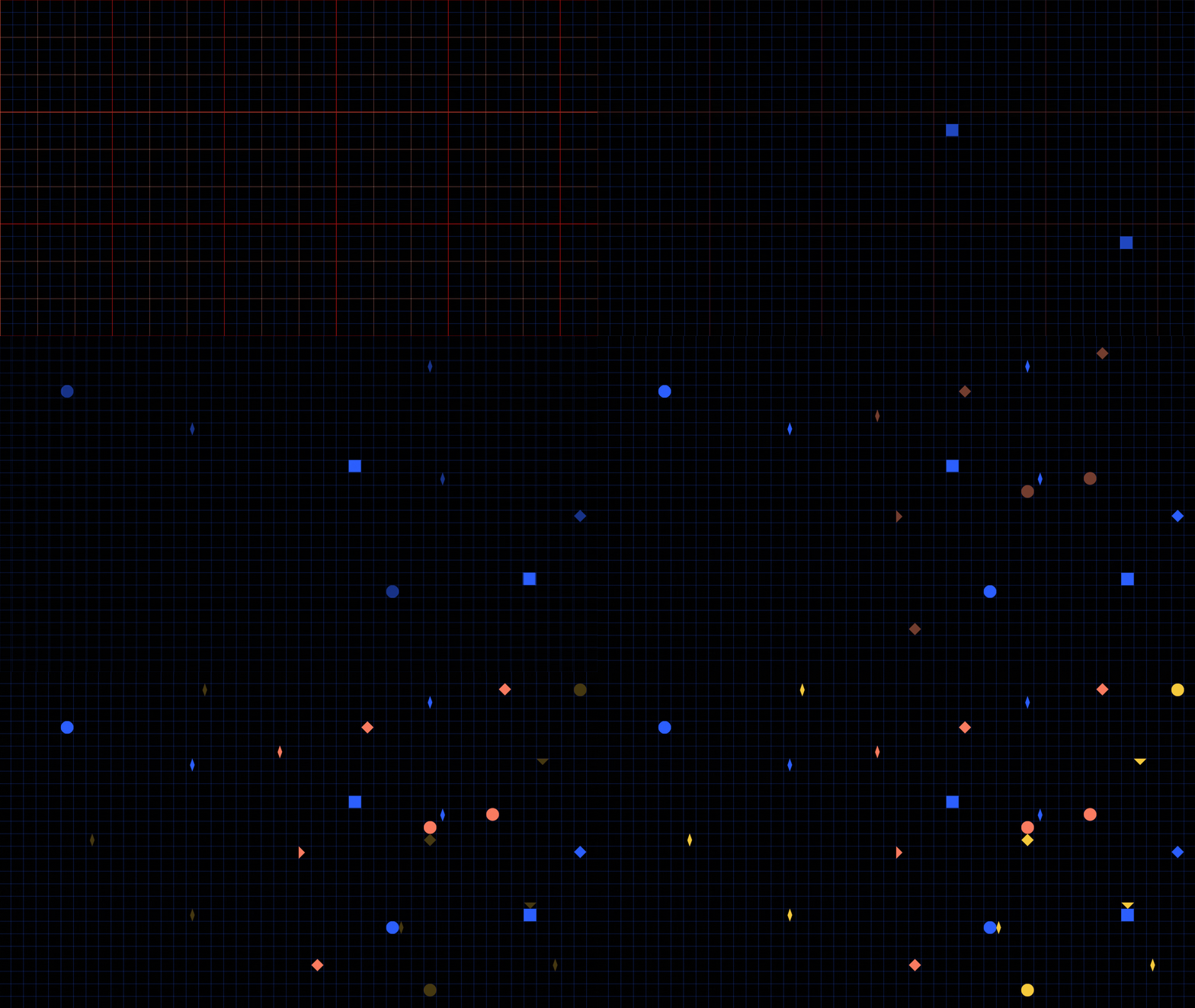
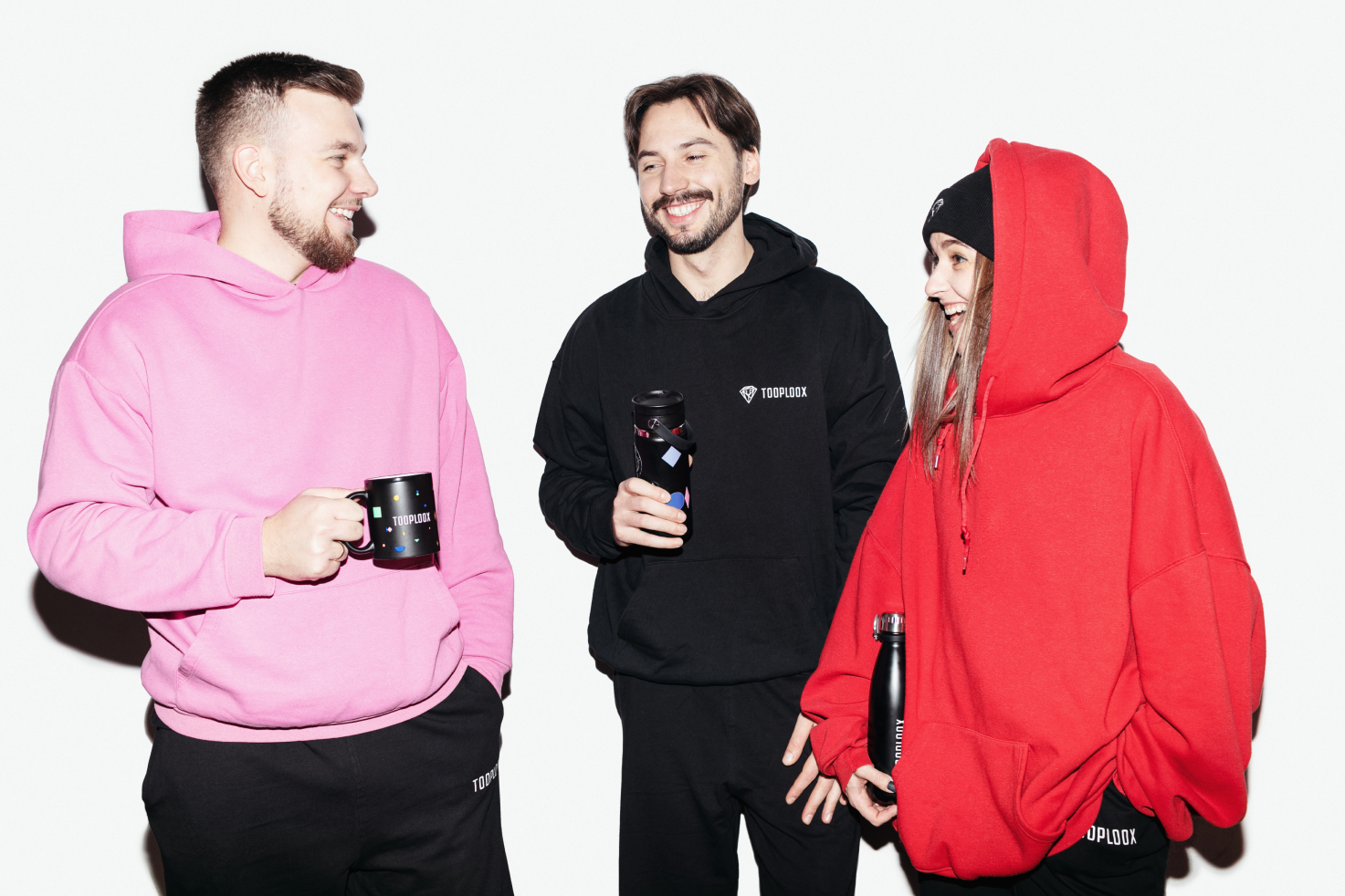
Scale, quantity, distribution: depending on the communication level we can use bigger seeds with a smaller number of seeds, small and limited seeds for when there’s a lot of content, or mix it to use it at its fullest potential when we design something fun, like swag or graphics for internal purposes!
“Seeing the brand system you’ve created grow, expand, and change during the implementation phase is great! On the one hand, it’s amazing to see it evolve and react with the final receiver, on the other hand, you are responsible to be a brand ambassador who will guard the rules and make decisions on the go,” comments Aga.
Summary
Brand design is the silent hero. We now have a strong voice and visual identity that represents who we are. The visual message is consistent with our text and story. We have a clear and powerful branding direction and tools, starting from communication strategy and fresh branding guidelines.
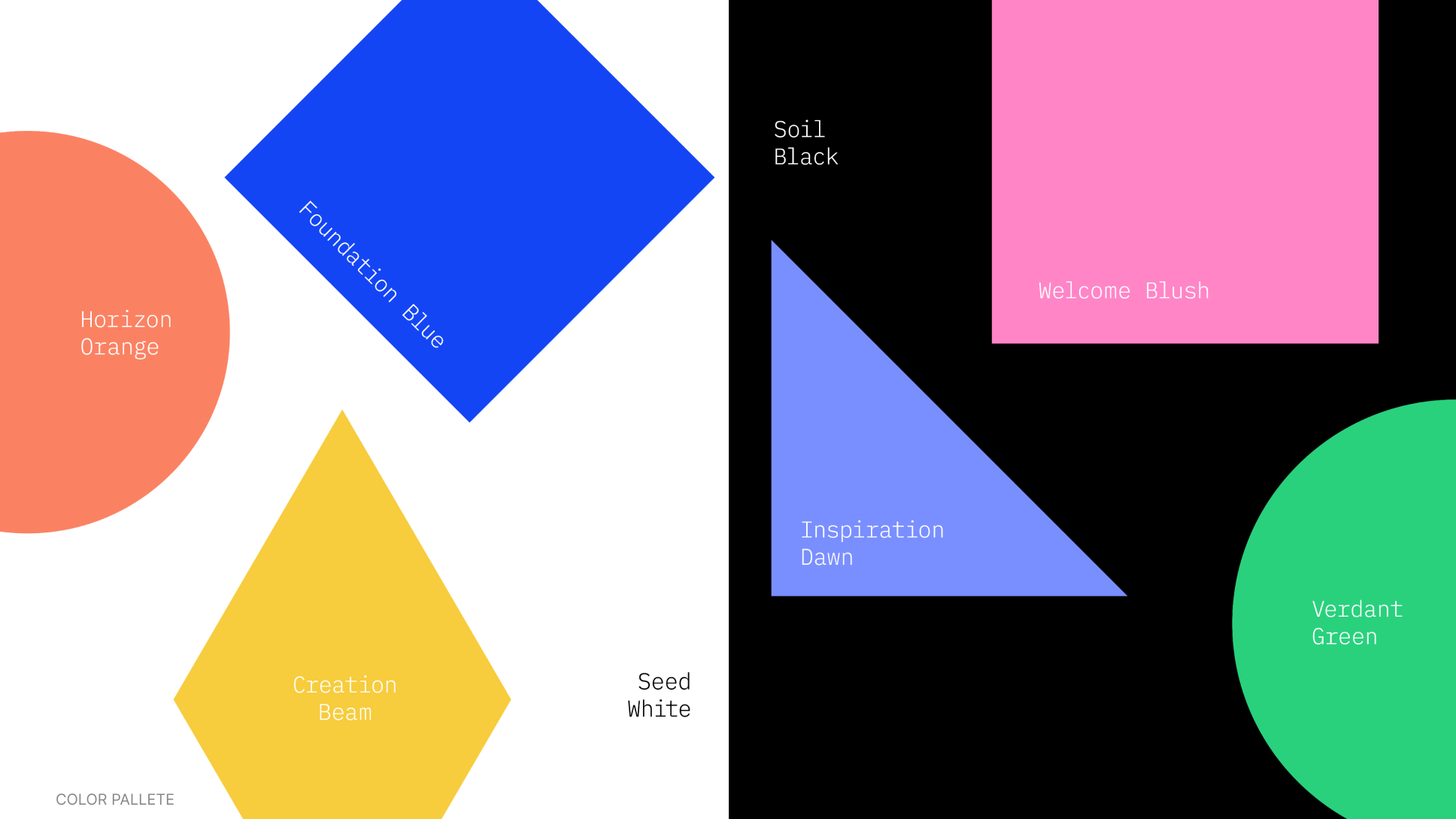
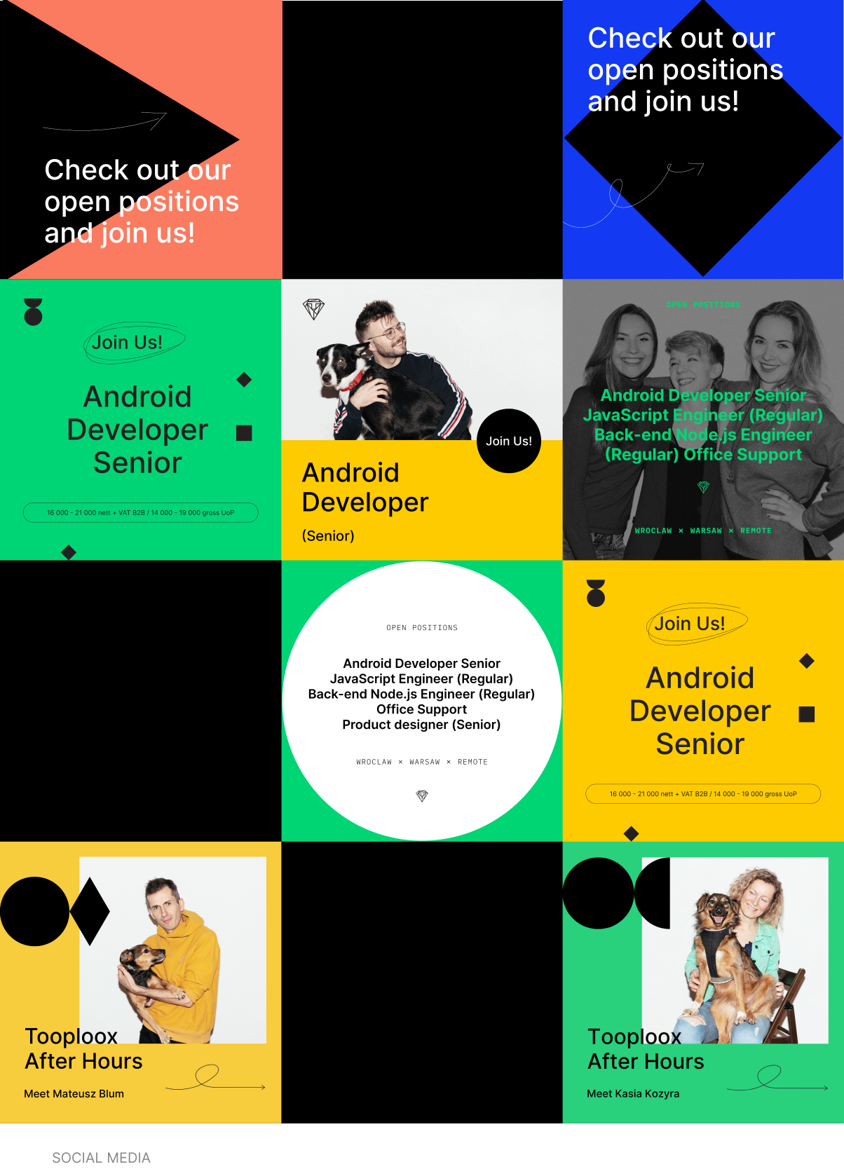
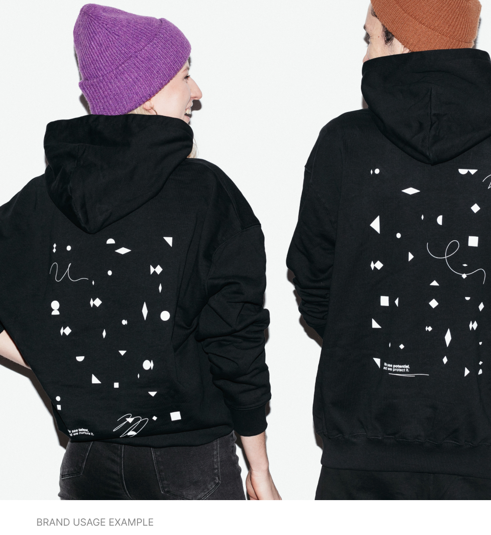
If you are interested in more visuals, you can find the full case study on Behance!
