good practices you should know about
In the new COVID-19 realities, turning to remote services has become not only a matter of convenience but one of necessity. From groceries to leisure, we rely on technology to cater to our most basic needs. This does not exclude taking care of our health, especially during the global health crisis.
According to Statista, by 2021 the global mHealth market was estimated to reach $100 billion, accounting for nearly half of the predicted total digital healthcare share of $206 billion.
In 2020 alone, the mHealth technology segment dominated the global market owing to the increasing penetration of smartphones and the rising number of strategic alliances among mobile operators & mHealth startups. It was most likely accelerated by the ongoing COVID-19 crisis.
This brings a lot of potential, financially rewarding opportunities for healthcare mobile app development. And mHealth itself is a very vast concept, encompassing a multitude of products and services for different types of users and needs.
Types of healthcare apps
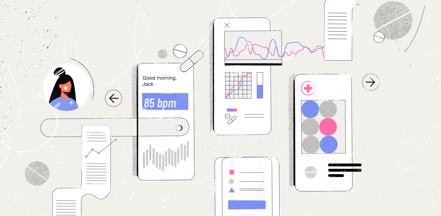
Thinking about healthcare app design, a division based on the end-user would seem most appropriate. We have tools that help us control our health on a day-to-day basis: keeping track of your family members’ health records, checking if the number of steps walked is way behind your goals, checking if you have taken your pills on time, monitoring your heart rate and providing diagnoses.
At the same time, we are witnessing major ongoing and future changes in the whole sector of digital health when it concerns healthcare providers, such as doctors, nurses, or general physicians, as well as institutions, like hospitals.
In general, most of the mobile apps dedicated to healthcare fall into three categories:
- healthcare apps for institutions
- medical apps for professionals
- and healthcare apps for patients
Obviously, the users’ needs for those three types differ in terms of functionality and UI design. For example, medical personnel often need to quickly find some piece of data (for example EHR/EMR, medication specifications, recommendations for diagnostics and therapy, reference materials).
Patients, on the other hand, should have to interact with as little information as possible, provided in simple and understandable terms.
Things to consider before designing a healthcare app
There are some common design practices that can make any healthcare app more effective, giving people the means to get what they need. Whether you think of developing an app for a hospital, health insurance company, medical database, or some other healthcare adjacent company, the app you design always has to check off a few boxes:
- it should serve a purpose
- it should be accessible in each design aspect
- it should be HIPAA compliant
When designing a mobile app it’s crucial to find a balance between functionality and form. The only way to achieve this balance is to conduct proper UX research and draw corresponding conclusions before kicking off the healthcare app design and development process.
How to design a healthcare app?
Besides business opportunities for app development in the healthcare sector, we need to remember that healthcare mobile apps affect people’s health behavior and their main purpose should be in helping to make their lives easier.
When done right, a mobile app provides healthcare professionals, patients, and other users with easy access to the information and resources they need.
The multidimensional purpose of mHealth might seem to be a bit too broad to distinguish some universal guide of how to design a mobile product of the kind that can answer users’ needs.
We may approach some healthcare mobile app design templates which exist here and there, but even if we want to use some ready-made assets, we still need to remember that there are a few specific elements you need to pay extra close attention to.
The Functionality Of An App

The design and functionality of the app should work together. Therefore the type and number of features in a healthcare app should depend on its user type and purpose. The first question that should be considered before designing a healthcare app is: why would somebody use this application (or a very similar one)?
For example, if this person is a patient wanting to contact a doctor, to schedule a call, or if this person is using the app to receive some health record or information – this functionality should be available right from the home screen.
This is because the main issue, as far as functionality in healthcare app design is concerned, is to avoid clutter and unnecessary “noise.” According to the Pareto principle, 80% of users tend to use no more than 20% of the available options. So, prioritize according to the app’s purpose and its users’ needs.
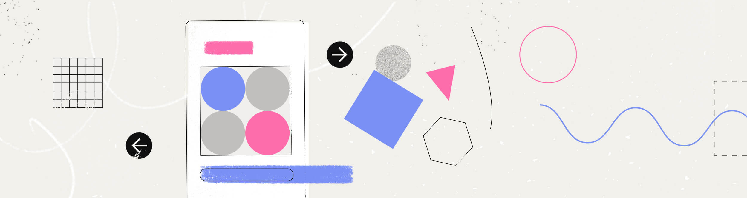
Colors In Mobile Design

While choosing colors during the healthcare app design process, it’s important to remember that accessibility is a must. There is a good chance that our app users have some impairments that may cause difficulties in using the app to its fullest. The wise thing to do is to bet on colors that sharply contrast with the background.
As far as the psychology of color is concerned, according to a study from 99designs, blue is overwhelmingly the most popular color used in healthcare design. Among healthcare industry-leading providers, blue appears in nearly 85% of all logos. What users associate with the color blue are knowledge, tranquility, security, and trust. In the stress-filled environment of healthcare, blue is a tried-and-true way to show your competence.
The versatility of healthcare applications however makes it difficult to outline some universal color restrictions. The most important thing we have to bear in mind is that the colors we choose in healthcare mobile app design should support the overall positive impression of the app and induce trust, as opposed to tension or any other unwanted feelings.
Typography In Design

When it comes to choosing the right font for a healthcare mobile app, the inherent logic is similar to the color issue. The most useful would be a style that triggers trust and causes no difficulties in visibility. Regardless of the type of a particular mHealth app user, the text should be able to hold the reader’s attention and focus it on key messages. Messages which, of course, will depend on the healthcare app’s purpose.
Such serious matters like those related to health or wellbeing, however, shouldn’t be transcripted in fonts that might be perceived as too festive, ornamental, or avant-garde. For example, healthcare.gov recommends highly legible sans serif fonts.
Navigation In Mobile Application
Last but not least. Navigation in healthcare mobile app design should be an issue of great importance. Medicine is a difficult and complicated discipline for ordinary people. The design of healthcare app navigation should reassuringly contrast with the complexity of medical issues in order to keep the users focused and make the app accessible.
But besides a basic empathy for users, healthcare mobile app without clear navigation will simply not be widely adopted. Properly designed navigation means a focus on the speed of use and effectiveness of the app, values perceived by people as user-friendly.
Therefore, standardized, well-known app navigation components are a must. Allowing users to receive important information on the surface and providing details upon request, and following the three-click rule will help you keep navigation in the healthcare app more effective and allow users to move around within it easily enough to have a pleasant user experience.
Wrapping Up
Health is a subject that deserves special care and attention. Designing healthcare products comes with a great deal of responsibility. The healthcare app development and design process should be focused on the users’ needs. And definitely, healthcare app design should balance the high usability requirements of medical applications with the proper aesthetic and correct functionality.
Read more our healthcare-related content: